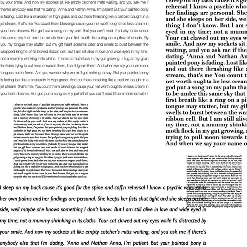
this was our fourth assignment, it was called "five squares, ten inches" simply because we had to create 5 squares of perfectly justified text and arrange them in a 10 x 10 square. if I could go back, there are a few small things I'd change about my final iteration of the assignment, but overall, I'm happy with the depth of field and various textures I achieved. I even managed to make overlapping text look good!
the text is an excerpt from the song "fatalist palmistry" by why?
No comments:
Post a Comment