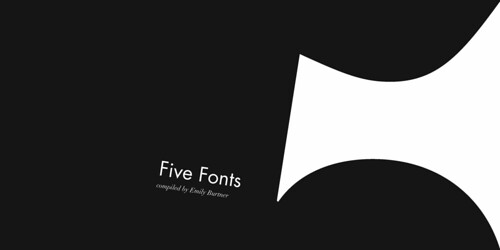
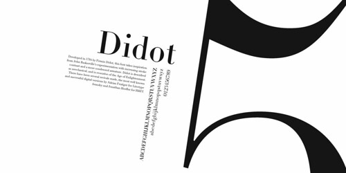
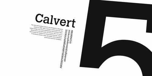
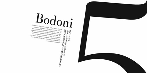
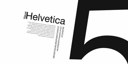
my fifth assignment in type 1 was the first assignment that introduced a hierarchy that would function on both the functional and aesthetic level. it's a book of five fonts, chosen by me. each page includes the name of the font, examples of each letter, and a brief description/history. I chose the following fonts, two serifs, two sans serifs, and a slab serif because I think they are beautiful and diverse examples of good typography and fonts I often choose to work with.

next is my type one final.
happy holidays!
I never thought I would like Didot so much but this semester I grew to love it ... because I totally took Type, right? Right?
ReplyDeleteyou totally just kinda took type through me and everyone else...
ReplyDelete